

My logo emerged from a desire to merge my initials into something that feels both personal and precise. The small turquoise accent isn't just for aesthetics - it represents that moment of clarity when an idea clicks into place. Every project starts with that same spark of inspiration.

Even when designing for myself, I maintain the same attention to detail I bring to client work. The logo has a carefully planned breathing space and clear rules for use, because good design should be consistent, whether it's for a global brand or a personal portfolio.

I chose turquoise as my signature color because it embodies creativity while staying grounded. Combined with black, white, and gray, it creates a palette that's bold enough to stand out but flexible enough to let my work shine through.

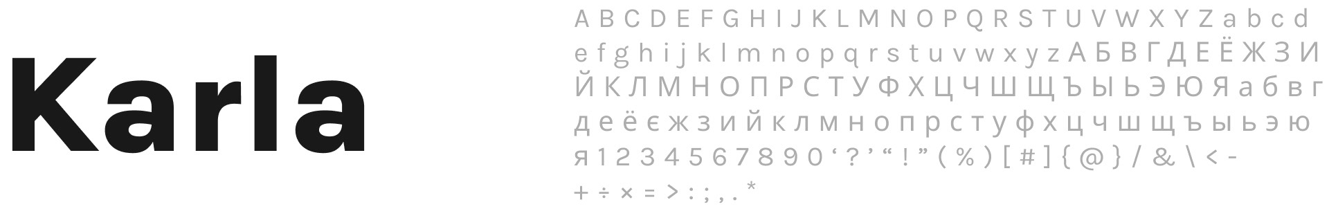
For my typography, I selected Karla - it's clean and professional, but with enough personality to feel human. Just like my approach to design, it strikes a balance between polish and authenticity.
Want to dive deeper into my design thinking? Scan the QR code or click here to view the complete brand guidelines.
