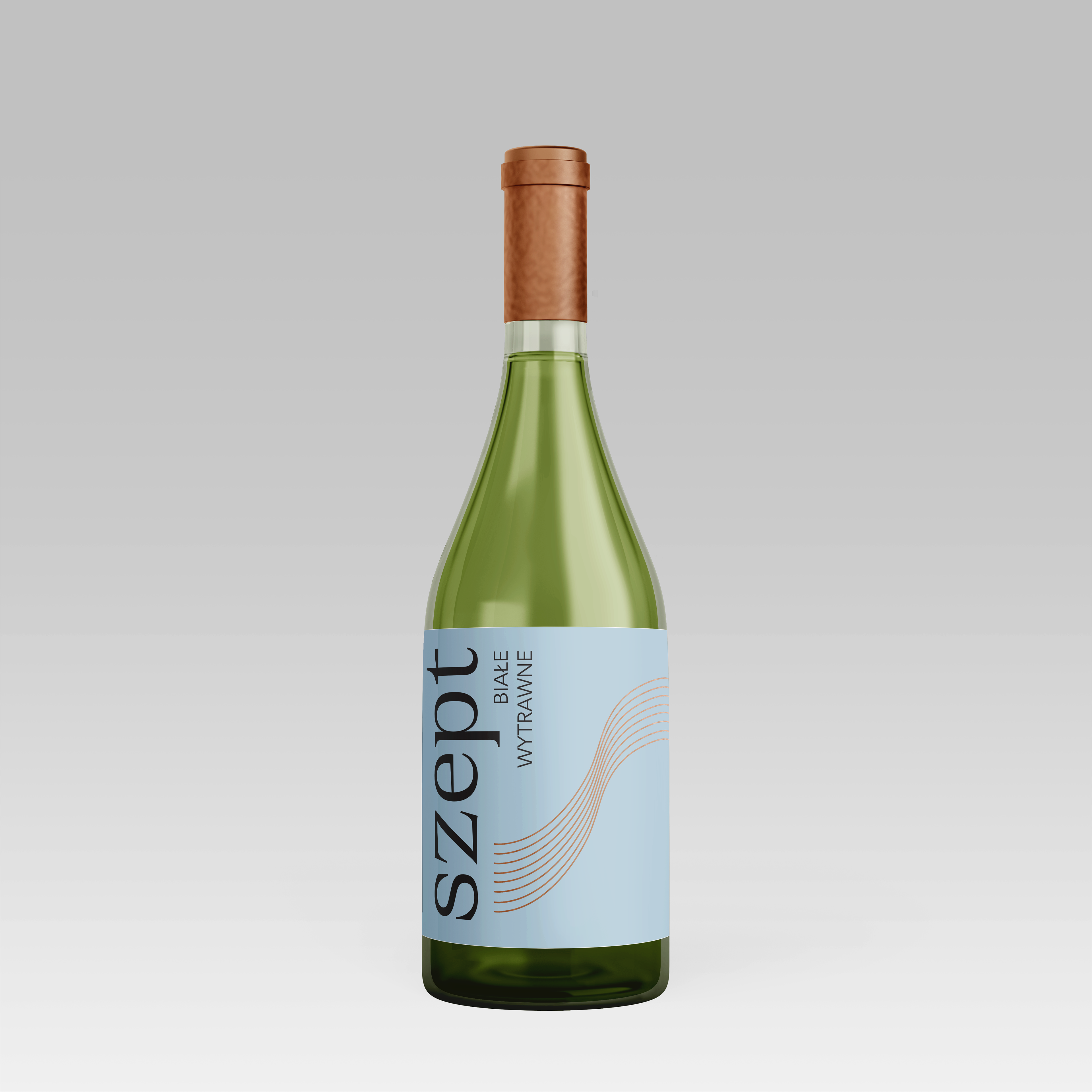
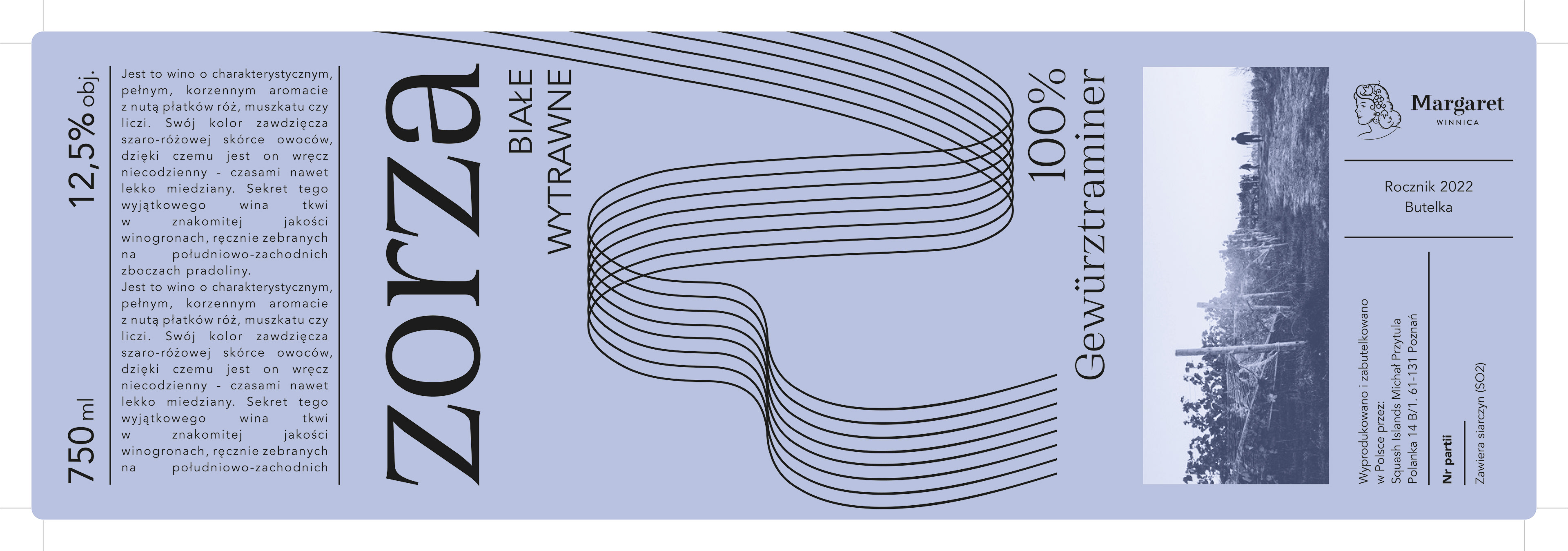
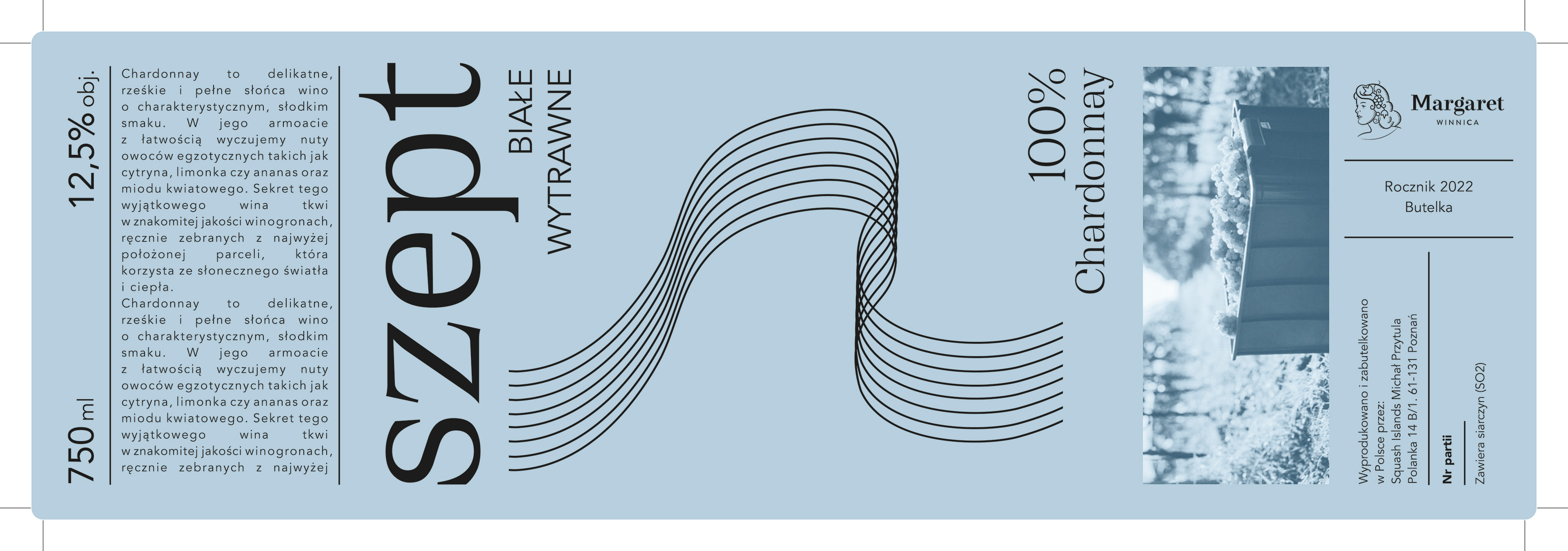
To emphasize the wine's high quality and premium positioning, I carefully considered the visual elements incorporated into the label design. This involved using refined typography, sophisticated color palettes, and elegant graphics to evoke a sense of exclusivity and luxury. The labels were crafted to convey a sense of craftsmanship and expertise, emphasizing the meticulous winemaking process behind each bottle.
To maintain consistency and ensure the labels harmonized with the winery's overall brand identity, I thoroughly studied the existing design aesthetics of their other products. This included examining their packaging, promotional materials, and visual elements. By understanding the winery's established design language, I was able to create wine bottle labels that seamlessly integrated with the brand's existing visual identity, reinforcing its reputation for excellence and craftsmanship.
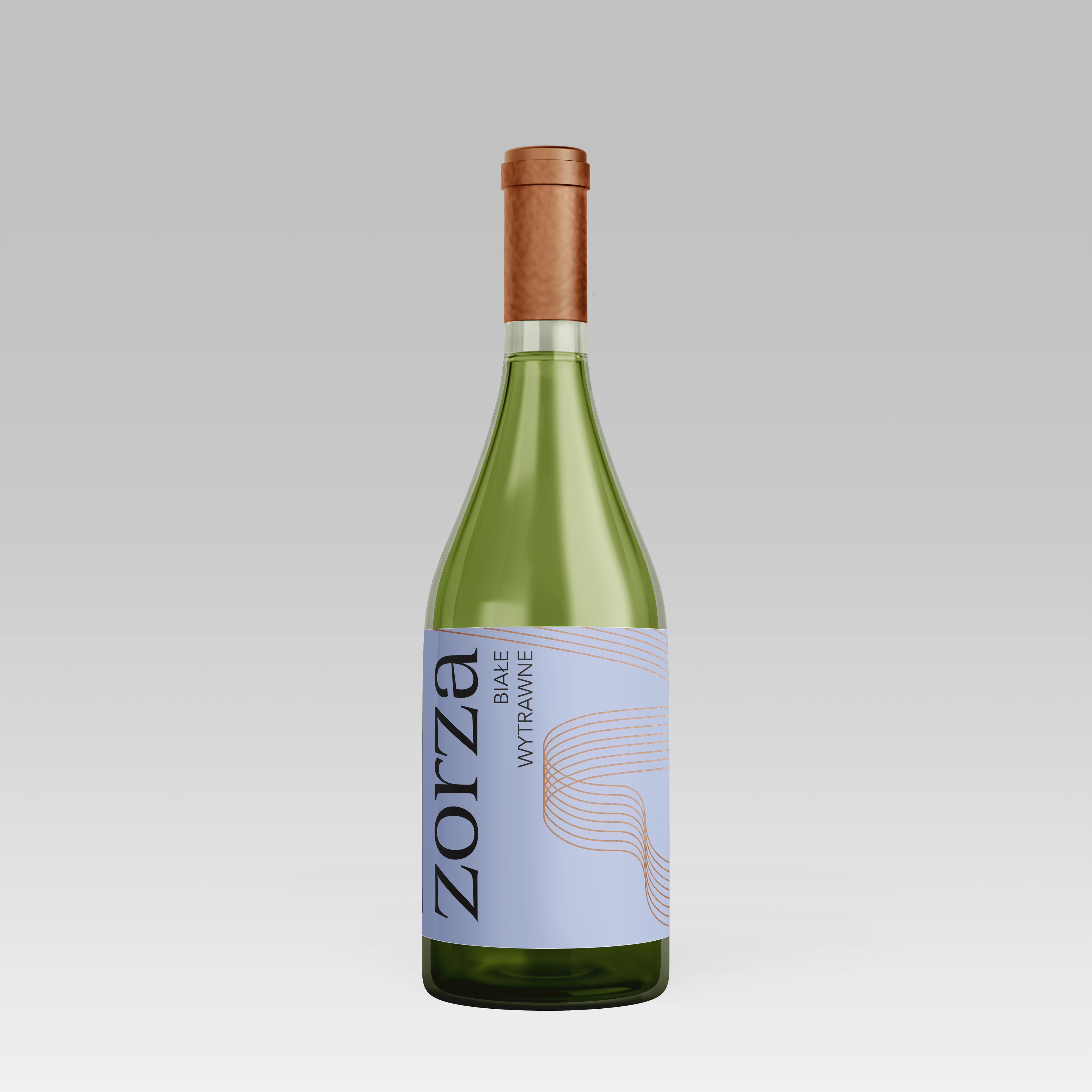
The label designs featured a combination of elegant typography, refined illustrations, and carefully chosen color schemes. The typography was selected to convey a sense of sophistication and refinement, while the illustrations and graphics added a touch of elegance and uniqueness. These design elements were thoughtfully arranged to create visually captivating labels that effectively communicated the wine's premium nature.
By creating wine bottle labels that conveyed a sense of high quality and premium experience, while also aligning with Winery Margaret's existing brand identity, I aimed to enhance the overall perception of the wine. The designs were carefully crafted to evoke a feeling of exclusivity and craftsmanship, reflecting the exceptional nature of the wine and captivating the attention of discerning wine enthusiasts.